BrandKit Design System
Overview
BrandKit is a maximalist-dark brand design system that centers on extreme typographic contrast — pairing an ultra-bold variable sans-serif display face (Uncut Sans) at heroic scales against a crisp technical monospace (DM Mono) for UI and annotation layers. The visual philosophy is one of restrained opulence: near-black backgrounds (#050505) serve as an infinite canvas where a single saturated blue (#0000ee) acts as both primary accent and interactive signal, while warm neutrals provide subtle hierarchy. The system feels simultaneously brutalist and refined — like a design studio's internal toolkit made public. Every element breathes through generous negative space, and the dominant visual voice is unapologetically type-first.
Color Palette
Core Colors
| Token | Hex | Usage |
|---|---|---|
| --color-primary | #0000ee | CTAs, links, active states, brand accent |
| --color-bg | #050505 | Page background, deepest surface |
| --color-text-primary | #ffffff | Headlines, display text, primary content |
| --color-text-secondary | #f5f1e6 | Body copy, muted annotations, warm off-white |
| --color-text-muted | #6e6d82 | Disabled states, tertiary information |
| --color-surface-elevated | rgba(255, 255, 255, 0.14) | Glass-morphism overlays, nav backgrounds |
| --color-gradient-blue | rgb(20, 10, 204) | Radial gradient anchor point |
Semantic
- Page background:
#050505— near-black, warmer than pure #000 - Primary CTA: transparent background with
#0000eeborder,#0000eetext; on hover, fill with#0000eeand invert text to white - Secondary / Nav buttons: transparent bg, white text/border, subtle glass effect (
rgba(255,255,255,0.14)) - Hover states: smooth 150ms ease transition on all properties; opacity shifts or color inversions depending on context
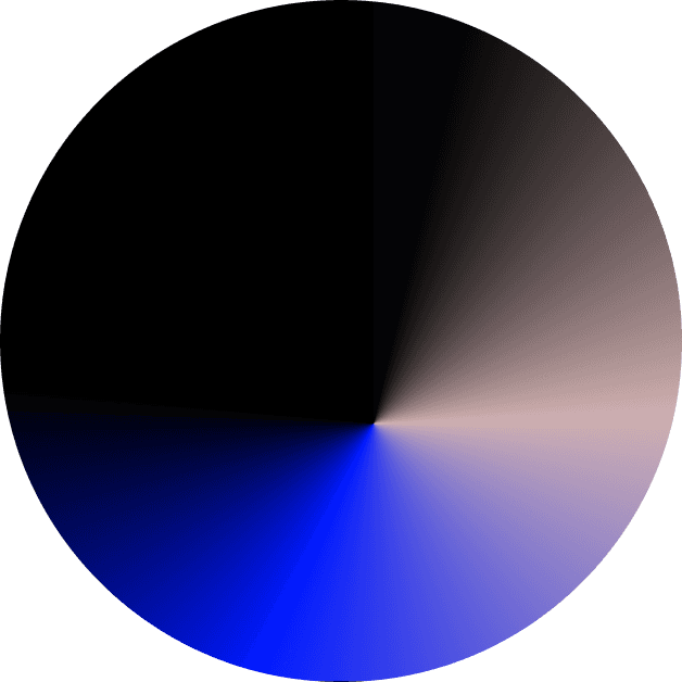
- Radial gradient overlay: anchored bottom-right, blending from deep blue (
#140acc) through violet to warm gray — creates atmospheric depth without competing with content
Typography
Font Families
--font-display: "Uncut Sans Variable Variable", "Inter", -apple-system, BlinkMacSystemFont, "Segoe UI", sans-serif;
--font-body:    "DM Mono", "IBM Plex Mono", "SF Mono", Consolas, "Liberation Mono", Menlo, monospace;
The system relies on a dramatic dual-font pairing. Uncut Sans Variable — a proprietary variable-weight grotesque with extreme weight range (up to 1000) — handles all display and heading duties at sizes that deliberately break conventional responsive norms (240px desktop H1). Its ultra-tight letter-spacing (-16.8px at max size) creates dense, sculptural wordmarks. DM Mono provides the counterpoint: a clean monospace at small sizes (10–13px) that reads as technical metadata, system labels, or editorial annotations. This juxtaposition of monumental display and microscopic mono creates the system's signature tension between human-scale impact and machine precision.
Type Scale
| Role | Family | Size | Weight | Line-height | Letter-spacing | Color |
|---|---|---|---|---|---|---|
| Display / H1 | Uncut Sans Variable | 240px | 1000 (Black) | 192px (80%) | -16.8px | #ffffff |
| H2 / Section heading | Uncut Sans Variable | 120px | 1000 (Black) | 96px (80%) | -6px | #ffffff |
| H3 / Subheading | Uncut Sans Variable | ~48–64px | 700–900 | 1.1 | -2px | #ffffff |
| Body / Label | DM Mono | 10px | 500 (Medium) | 9px (90%) | -0.3px | #ffffff / #f5f1e6 |
| UI Mono | DM Mono | 13px | 400 (Regular) | 1.4 | 0 | #ffffff |
| Caption / Micro | DM Mono | 9px | 500 | 1 | -0.2px | #6e6d82 |
Typography Notes
- Display text uses aggressive negative letter-spacing proportional to size (roughly -7% of font-size at H1, -5% at H2)
- All uppercase rendering for body/label text in DM Mono — the monospace face functions as a titling/caps layer
- Braces
{ }used decoratively around labels (e.g.,{ BRANDKIT PRO }) to reinforce technical/systemic aesthetic - Weight 1000 (extra-black) is the default for all display/heading roles — never go below 700 for headings
- Font-size scales aggressively non-linearly; mobile will need significant scaling reduction (H1 → ~64–80px)
- Line-height is extremely tight for display (80%) to create stacked-line density
- Registered trademark ® symbol appears inline with brand name in navigation
Spacing Scale
2px   — micro-separators, hairline gaps
4px   — icon padding, minimal internal gaps
10px  — base unit (most frequent value), nav item padding, tight component gaps
16px  — small component padding
20px  — standard padding, section gutters
30px  — medium spacing between grouped elements
32px  — larger component padding
70px  — major section vertical rhythm
120px — hero/container outer padding, viewport-edge breathing room
Container widths:
- Max content width:
1400px - Full-bleed sections: 100vw (gradient extends edge-to-edge)
- Side padding:
20pxmobile,20–40pxdesktop (container is centered at 1400px) - Section vertical padding:
120pxfor hero/main containers
Border Radius Vocabulary
--radius-none: 0px         — sharp edges on nav pills, decorative elements
--radius-sm:   4px         — buttons, input fields, small cards
--radius-md:   10px        — larger containers, card surfaces
--radius-full: 9999px      — pill-shaped tags, fully rounded buttons (if needed)
The system favors slightly rounded corners over fully square ones — 4–10px provides softening without feeling playful.
Shadow Vocabulary
(no box-shadows detected)
BrandKit employs a flat, shadowless aesthetic. Depth is created instead through layer opacity (glass-morphism at 14% white), radial gradients, and z-index stacking rather than traditional drop shadows. Cards and elevated surfaces rely on background-color differentiation alone.
Component Recipes
Primary CTA Button
background-color: transparent;
color: #0000ee;
border: 1.5px solid #0000ee;
border-radius: 4px;
padding: 12px 24px;
font-family: "DM Mono", monospace;
font-size: 13px;
font-weight: 400;
letter-spacing: 0;
transition: all 150ms ease;
cursor: pointer;

/* Hover state */
&:hover {
  background-color: #0000ee;
  color: #ffffff;
}

/* Contains right-arrow icon inline */
Secondary / Ghost Button (Nav Pills)
background-color: rgba(255, 255, 255, 0.06);
color: #ffffff;
border: none;
border-radius: 4px;
padding: 8px 16px;
font-family: "DM Mono", monospace;
font-size: 10px;
font-weight: 500;
text-transform: uppercase;
letter-spacing: -0.3px;
transition: all 150ms ease;
white-space: nowrap;
Navigation Header
- Position: Fixed or sticky top, full-width, z-index high
- Background: Transparent (
rgba(0,0,0,0)) with potential glass effect on scroll - Height: Auto, approximately 56px content area + 20px vertical padding
- Layout: Centered container (max-width 1400px), flex row
- Left contents: BrandKit® badge/button (pill-shaped, glass bg)
- Center contents: Nav links — Logo, Color, Type, Photo, Icons (each a ghost pill button)
- Right contents: More menu ("...") trigger button
- Padding: 20px horizontal within 1400px container
- Mobile: Collapses to hamburger or horizontal scroll
Hero Section
- Background:
#050505base with large radial-gradient overlay positioned bottom-right (blue → purple → warm gray) - Min-height: Approximately 80–90vh
- Layout: Centered column, text-left aligned but visually balanced
- Elements stacked vertically:
- Micro label:
{ BRANDKIT PRO }— DM Mono 10px, white, centered, tracking wide - Display headline: "BrandKit" — Uncut Sans 240px, weight 1000, white, left-aligned
- Subheadline: "BRAND DESIGN SYSTEM" — Uncut Sans ~32–48px, weight 700+, white, centered under display text
- Description: "A FULL SCALE BRAND IDENTITY SYSTEM" — DM Mono 10px, caps, centered, warm white
#f5f1e6 - CTA button: "Explore BrandKit®" with arrow icon — centered, outlined style
- Micro label:
Gradient Overlay Element
- Type: Radial gradient, positioned absolute/fixed
- Colors: Center anchor
rgb(20, 10, 204)(deep blue), radiating outward through violet tones intorgba(200, 190, 210, 0.4)(warm gray-lavender), finally fading to transparent - Position: Bottom-right quadrant, extending beyond viewport edges
- Blend mode: Normal (not multiply/screen) — sits behind content via z-index layering
- Purpose: Creates atmospheric depth and brand color presence without competing with foreground typography
Motion & Animation
Transition Tokens
--transition-fast:   all 150ms ease;
--transition-smooth: all 250ms ease-out;
Keyframe Animations
- No named keyframe animations detected in static extraction; Framer runtime may inject scroll-triggered entrance animations (fade/slide) dynamically
Interaction Patterns
- Buttons:
all 150ms easetransition covering background-color, color, border-color, opacity - Hover on nav pills: slight background opacity increase (0.06 → 0.12)
- Hover on primary CTA: color inversion (transparent→filled)
- No parallax, marquee, or complex scroll animations visible in static capture
- Cursor may be customized (class
framer-cursor-nonesuggests custom cursor treatment) - Overall motion level: still/subtle — the system lets typography be the animation
Layout System
Grid
- Mobile (<768px): Single column, full-width padding 20px, display font scales down dramatically (H1 ≈ 48–64px)
- Tablet (768px–1200px): Single column, centered container, reduced display sizes (H1 ≈ 96–120px)
- Desktop (>1200px): Centered 1400px max-width container, full display sizes (H1 240px), generous padding 120px vertical
Header Architecture
[BrandKit® pill]  [Logo] [Color] [Type] [Photo] [Icons]     [...]
 ←——————————————————— centered in 1400px container ———————————————————→
                    (transparent/glass background)
Hero Section Architecture
┌─────────────────────────────────────────────────────┐
│                                                     │
│              { BRANDKIT PRO }                       │
│                                                     │
│          BrandKit                                   │
│          (240px, -16.8px tracking)                  │
│                                                     │
│           BRAND DESIGN SYSTEM                       │
│                                                     │
│       A FULL SCALE BRAND IDENTITY SYSTEM            │
│                                                     │
│              [ Explore BrandKit® → ]                │
│                                                     │
│                                    ╲                │
│                                     ╲  ← radial     │
│                                      ╲  gradient     │
│                                       ╲ (blue/purple)│
└─────────────────────────────────────────────────────┘
Imagery Style
- No photography or illustration present on this landing view — purely typographic and gradient-driven
- The radial gradient serves as the sole "imagery," functioning as abstract atmospheric art
- Future pages in this system would likely feature high-contrast product mockups, brand asset previews, or stark studio photography
- Any imagery added should maintain the dark-mode, high-contrast, desaturated-except-for-accent-blue palette
- Treat images as supporting elements — type always leads
Icon System
- Library: Custom SVG (Framer-native or hand-crafted)
- Specific icons observed: Right-pointing arrow (→) inside CTA button, three-dot menu (...), possibly hamburger on mobile
- Treatment: Stroke-based, 1.5–2px thickness,
#0000eeor#ffffffdepending on context, sized 14–16px, aligned inline with text baseline - Arrow icon: Appears inside the primary CTA button, right-aligned within padding
Recommended Frontend Stack
- Framework:      Next.js 15 (App Router) or Astro (static-first)
- Styling:        CSS Modules or Vanilla CSS with custom properties (no Tailwind required)
- Fonts:          Google Fonts: DM Mono (free); Uncut Sans substitute → Archivo Black or Bebas Neue for display
- Animation:      Framer Motion (if recreating Framer interactions) or vanilla CSS transitions
- Icons:          Custom SVG components or Lucide (arrow-right, more-horizontal)
- Component lib:  None (custom primitives) or Radix UI for accessible nav/dropdown primitives
Design Principles
- Type as architecture — Display typography isn't just content; it's the structural skeleton of every layout. Sizes that seem "too big" are correct. The 240px H1 is a deliberate statement.
- Dark-first depth — Never simulate lightness with shadows. Create atmosphere through layered opacity, gradients, and z-index. The background is alive, not empty.
- Mono as metadata — Monospace text signals "system," "code," "annotation." It's the voice of the machine commenting on the human-scale display type. Use it for everything that isn't the main message.
- Single-accent discipline — One saturated color (#0000ee blue) carries all interactive and brand weight. Resist adding secondary accents. Restraint amplifies impact.
- Brutal warmth — The combination of ultra-bold grotesque type, near-black backgrounds, and a warm off-white secondary text (
#f5f1e6) creates a distinctive temperature: industrial but not cold, luxurious but not ornate. - Scale breaks intentionally — Responsive design here doesn't mean "make everything smaller proportionally." It means recomposing: a 240px desktop H1 might become a 56px mobile H1, while the mono labels stay fixed at 10px everywhere.